Application Form Design Standards
HighStone is designed to use the standard Windows functions for assigning colour and font styles to the application panels and controls. This allows the application to pick up the general Windows Theme that has been set on the target computer - and apply the style configurations that are relevant to Windows XP, Windows 7 etc.
Topics on this page:
Panel Caption and Border Styles
The caption and border styles on all HighStone Panels are set by the current Windows Theme Configuration and the application has no means of adjusting or resetting the display style for these elements. If desired the Border Style can be reset on the host computer - although the changes will be applied to all application panels on the system and will not be limited to HighStone.
HighStone operates in a primarily 'Modal' mode whereby only one display panel is live or active at any one time. When a panel is opened within HighStone, the new panel is displayed over the top of the calling panel, and the calling panel is disabled until to the newly opened form is closed by the user. To support this mode of operation the following configuration settings are applied to panels:
- Opened panels show no Icon in the panel caption, and the Control Box (Minimise, Maximise and Close buttons) to the top right is also omitted.
- The panel does not show as an entry in the Task Bar at the foot of the computer screen.
Clicking on the HighStone icon on the Task Bar will return focus to the active (topmost) panel within the Application.
HighStone does allow some panels to be opened alongside others - and does not require these panels to be closed before returning to other areas of the Application. The SQL Test Panel and the Database Table Management facilities are examples of these. In such cases the Panel will be shown as a separate button in the current Task Bar.
HighStone controls the panels that are opened by the User within the Application.
- Closing a panel will automatically close other panels that have been opened in a non-Modal style from that panel.
- Where a user can move between Data Objects (e.g. from Incidents, to Works Orders related to the displayed Incident Record etc), HighStone will not allow a recursive call to open an Object Panel Class that is already opened within the Application. Thus a User can move from Incident Record to a related Works Order Record, but a further move to an Incident Record panel is prevented.
Panel and Control Colours
HighStone applies the library of System Colours to panel and control designs - thereby allowing the Application to pick up the current Windows Theme colour styles. These are set in the following table.
Property Settings for Design Objects
|
Control Class |
Examples |
Background Colour |
Foreground Colour |
|
Panel Forms |
All Panels, Tab Controls etc. |
System Colour: Control |
System Colour: ControlText |
|
Command Controls |
Command Buttons |
System Colour: Control |
System Colour: ControlText |
|
Entry Controls |
Text Boxes, Combo Pull-downs used to show data values that can be changed by the User |
System Colour: Window |
System Colour: WindowText |
|
Locked Entry Controls |
Label Controls used to show data values that can not be changed by the User; displayed as labels including a border to mimic Text Box controls. |
System Colour: Window |
System Colour: WindowText |
|
System Data Values |
Label Controls used to show system data values that are provided for reference (e.g. data record Identifiers); displayed as labels including a border. |
System Colour: Control |
System Colour: ControlText |
|
Field Captions (General) |
Labels annotating Entry Controls |
System Colour: Control |
System Colour: ControlText |
|
Caption Sub Headings |
Labels used to identify key data fields, or headings to a group of data fields. Font usually shown in Bold for Headings, may be in a standard style to identify a key data field. |
System Colour: Control |
Custom Colour: Maroon |
|
Caption Main Headings |
Labels used in Panel Title Captions. Font usually shown in Bold, and to a larger font size. |
System Control: Control |
Custom Colour: Blue |
|
Data Grid Controls |
Data Grids shown on all panels use a Default Colour Style, but this is usually overridden by an light alternating row shading. |
System Colour: Window |
System Colour: WindowText |
|
Sub Panels |
In some instances sub panels are included with a highlighting border. These are designed to draw attention to a sub-set of key data entry controls. |
System Colour: ActiveBorder |
System Colour: ControlText |
|
Key Fields and Warnings |
Custom Colours are used in certain cases to highlight specific warning prompts and captions. |
Not Applicable |
Custom Colour: Red |
|
Key Controls |
Custom Colours are used in certain cases to highlight specific controls. The Foreground Colour is set to either Black or White - depending on the density of the highlight background colour. |
Custom Colour: Red, Green, Yellow, Orange |
Custom Colour: Black or White |
Sample Panel Colours
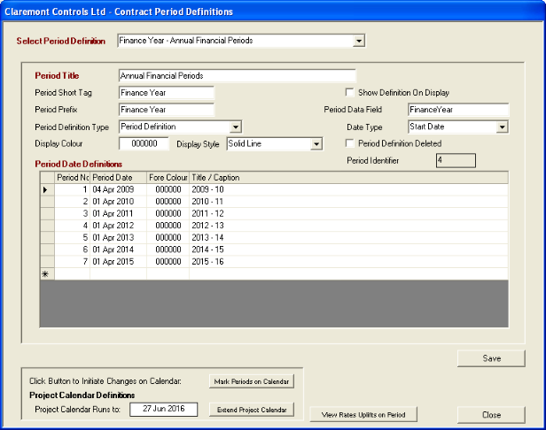
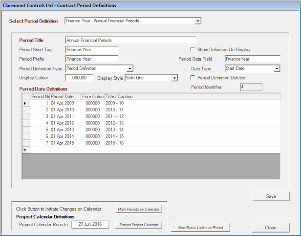
The following images show the default colour scheme as applied to standard Windows XP and Windows 7 Systems (in the case of Windows 7 the style is a 'non-aero' style). Note that the Text Box and Combo Pull-down Controls are shown as black text on a white background. The System Data Record Identifier is shown with the same Background colour as that used on the Form Panel, whilst the Project Calendar Date shown at the bottom of the panel is a locked panel (Label) shown in the same colour style as that used in Text Boxes.
Colour Style for Windows XP
Colour Style for Windows 7 (Non-Aero)
Changing Windows Display Panel Title Characteristics
The following steps may be followed to adjust the caption style for all Windows panels on the system - Note that this is a global change across the entire system and not limited to just HighStone. A change of this nature may be useful on small form screens (like tablet PCs running a full Windows 7 OS) to improve legibility. The notes given relate to Windows 7.
- Click with the RMB on the Desktop background of the system. Then select the item Personalize.
- Alternatively access the necessary settings through Start > Control Panel > Display > Personalization.
- If not already specified, select a Theme that allows a change to the Panel Configurations (n.b. Windows 7 Aero Themes do NOT support such a configuration, but Basic and High Contrast Themes do support the required configuration).
- Towards the bottom of the panel click on the Window Color link to access the configuration settings.
- From the list of Panel Items in the pull-down control select the entry for Active Title Bar.
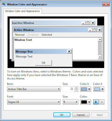
- Adjust the Size (Height) setting to that required and increase the Font Size by a corresponding proportion to improve the legibility of the Caption Titles.
- It is also possible to change the caption background colour, and font style / foreground colour applied to the panel.
- Click on the Apply command button to save the changes. All panels on the display will be recast to the new style.
On Windows XP Systems the same controls are found under Properties > Display Properties > Appearance > Advanced Appearance functions; or also found under the system Control Panel > Display.